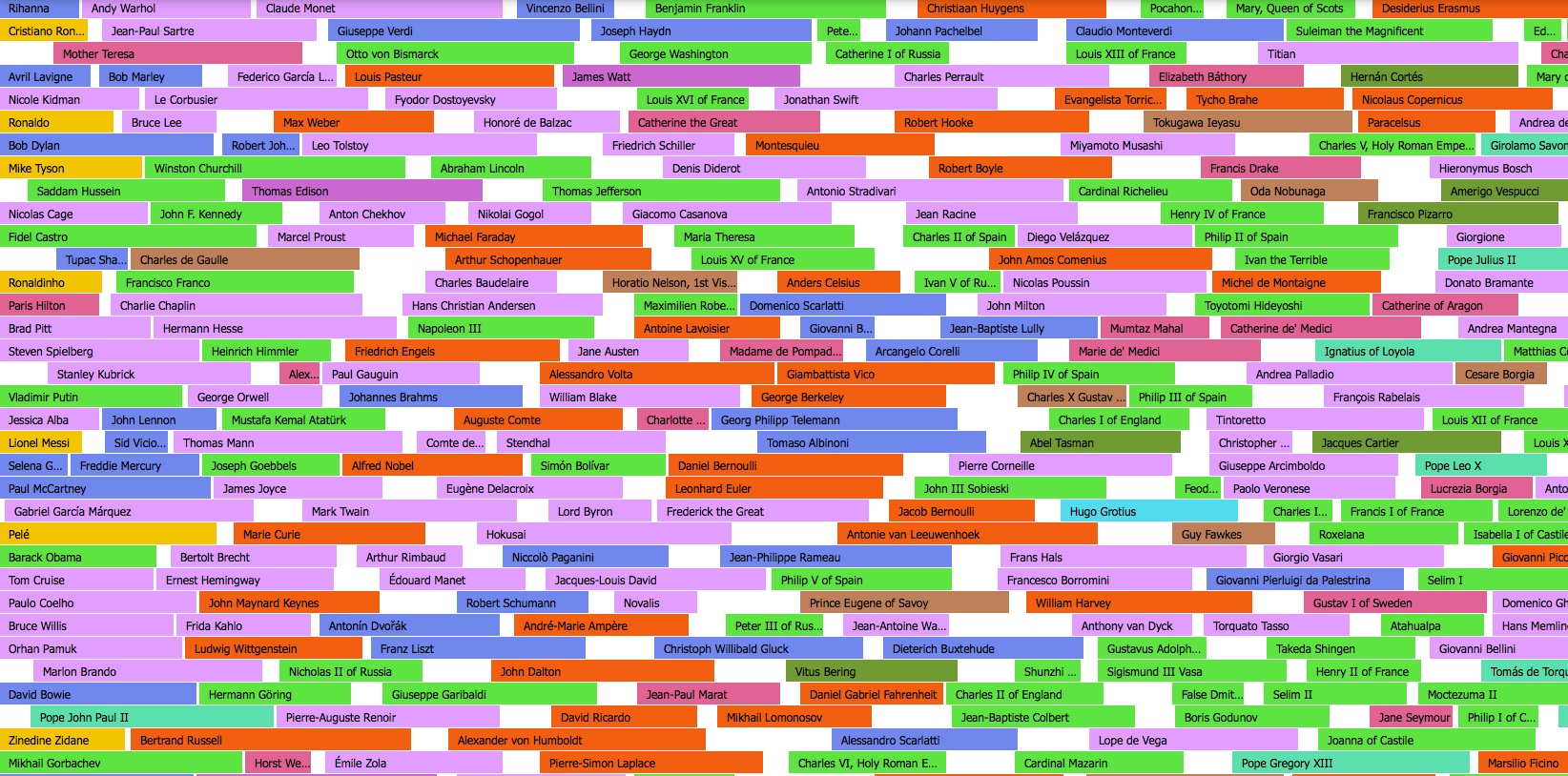
Map of Contemporaries
This History Timeline is an interactive website which shows hundreds of historic people on a timeline going back thousands of years. You can view the people by geography and occupation.ybogdanov.github.io/history-timeline
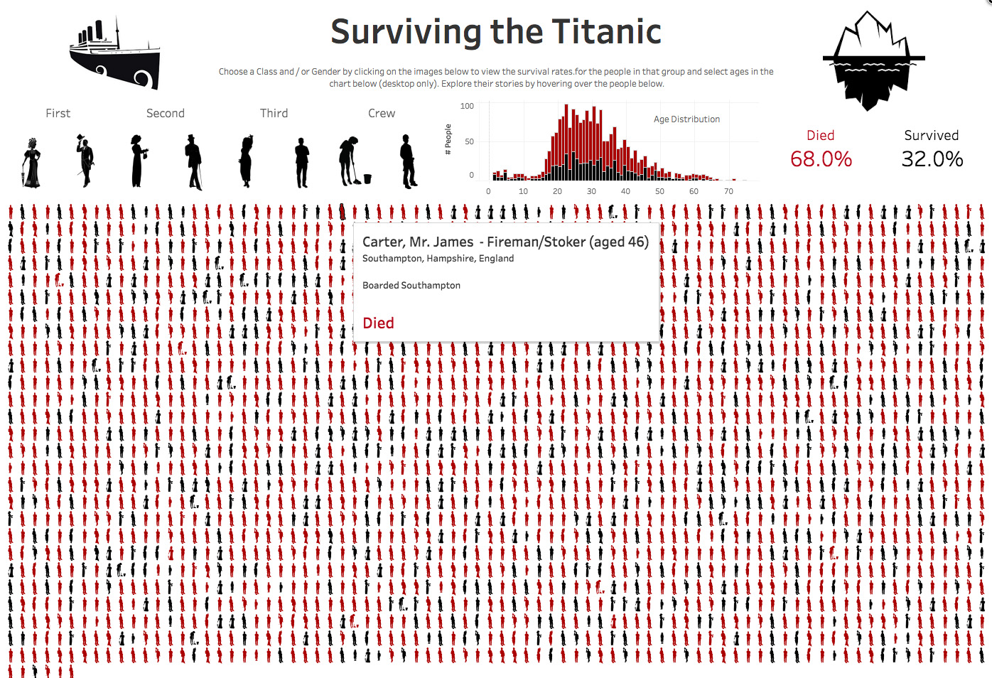
Surviving the Titanic
An infographics showing the fates of all the people on the Titanic, either individually, or categorised by class or crew.public.tableau.com/views/Titanic_265/Titanic
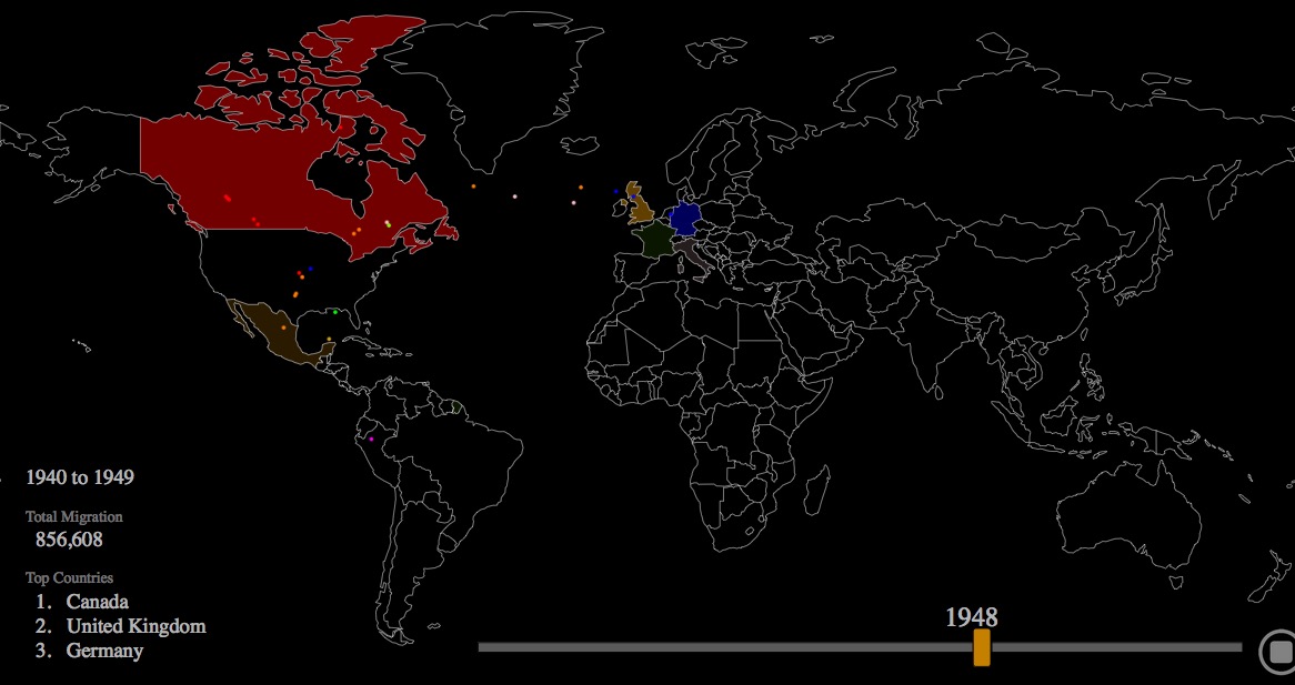
Two Centuries of US Immigration
This interactive shows where from and when immigrants went to the US. You can let it just play through the years or use the slider yourself.metrocosm.com/us-immigration-history-map.html
Slavery in the US
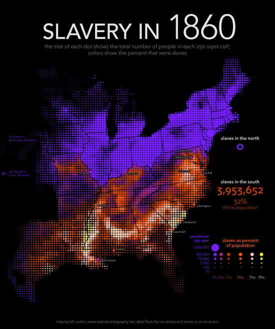
These maps show the spread of slavery in the United States 1790-1870. Each map is accessed by rolling over the year. The maps are plotted by population density and not by the usual, and misleading, method of plotting by county.radicalcartography.net/index.html?slavery
Named
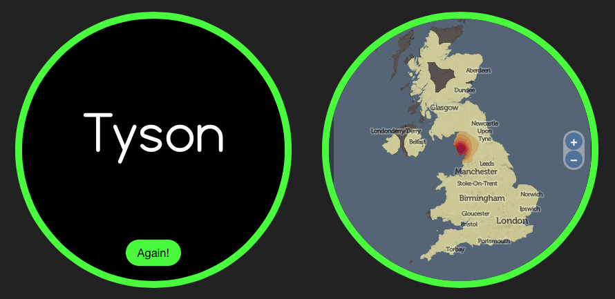
An interactive webpage where you enter a surname and it maps places in the UK where that surname has a historically unusually high local population. My surname is Tyson and this maps precisely the area in Cumbria that my father’s family comes from.named.publicprofiler.org
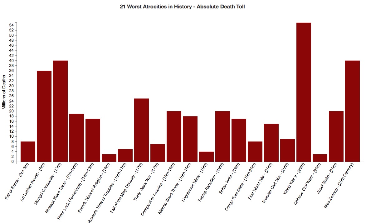
21 Worst Atrocities in History
This interactive shows the worst death tolls throughout (and because of) human history. You can view the figures as absolute numbers or compared to 1950s figures. There's not much interactivity, per se, but it is interesting.countingcalculi.com/better_angels_project/the_21_worst_atrocities